Transforming Smiles: A Story of Rebranding for Sky Dental
Hello, readers! I’m Roxana, the proud owner of Thinkstor Global Strategies, and as our first blogpost, I’m excited to share the story of one of our latest and most rewarding projects — a complete rebranding for our incredible client, Sky Dental LLC.
When Dr. Cristiana Oltean DDS, the owner of Sky Dental, approached us, she had a clear vision: to transform her dental practice’s image and digital presence. Sky Dental is very well-regarded for its excellent care, but its brand and website didn’t fully convey the exceptional quality and compassion that Dr. Cristiana and her team have to offer. It was time for a change, and we were thrilled to take on the challenge.

Step 1: Initial Meeting with the Client
Our journey began with an in-depth meeting with the client. This initial discussions are always crucial for both parties. We need to understand their vision (or help translate it) and the essence of the practice. We delved into questions about the current perception of the practice, the target audience, and the desired brand identity. Dr. Cristiana’s passion for her work and her artistic vision for the practice shone through, providing a very rich foundation for our work.
Step 2: Asking the Right Questions
To build a strong foundation for the rebranding, we asked key questions such as ”What is the current perception of Sky Dental, and how do you want it to change?”, ”How do you envision your brand’s visual identity?”, we then proceeded to find out traits of the existing and targeted audience and the key values of the members at Sky Dental. These type of questions, however common or “boring” in the world of branding, really help uncover key information about the business and aesthetic preferences that would shape the rebranding process.
Step 3: Debriefing the Team
This step ensured that everyone is aligned and understands exactly the project’s scope and objectives. Our team of designers, developers, and copywriters were thrilled to bring Sky Dental’s new identity to life. We’ve never worked on medical websites before, so this was a great and very exciting first challenge for all of us.
Step 4: Creating a Brand DNA Document & a Visual Moodboard
A brand DNA is an essential document that guides the reader in their understanding of the business. After doing extensive copywriting work, the brand now clearly defined the mission statement, a set of core values that highlight what the company stands for, and a carefully crafted brand persona that establishes the tone and character of the brand, besides other elements.
Visually, we captured the desired aesthetic and artistic direction through a visual moodboard. A moodboard usually includes the color palette that resonate with the brand’s identity the most, the typography and curated imagery.
It is a visual reference both throughout the rebranding process, and thereafter.

Step 6: Crafting a Unique Company Persona
We worked on defining Sky Dental’s company persona—friendly, compassionate, highly knowledgeable and professional. This persona guided all visual and textual elements, ensuring consistency across all brand touchpoints.
Step 7: Creating the Web Design
With the brand DNA and moodboard in place, we moved on to web design. Our team focused on creating a minimalist, seamless, user-friendly website that embodied Sky Dental’s commitment to excellence in dental care. Key aspects included the UX (User Experience) which had to be accessible and easy to navigate, the content strategy (adding informative and engaging content), and the visual design. The latter had to reflect the brand’s new identity through the simple, modern and flowing layout. Our main priority was for it to feature ample white space, intuitive navigation, and fluid transitions between sections.

Step 8: Professional Photoshoot
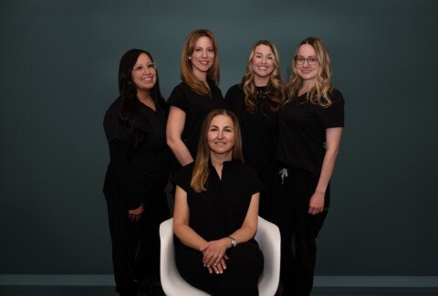
To enhance the authenticity of the new brand image, we coordinated a professional photoshoot at Sky Dental’s office. This included new headshots and team images that aligned with the brand’s visual identity. High-quality visuals are crucial for creating a professional and welcoming online presence.
Step 9: Designing Stationery and Business Cards
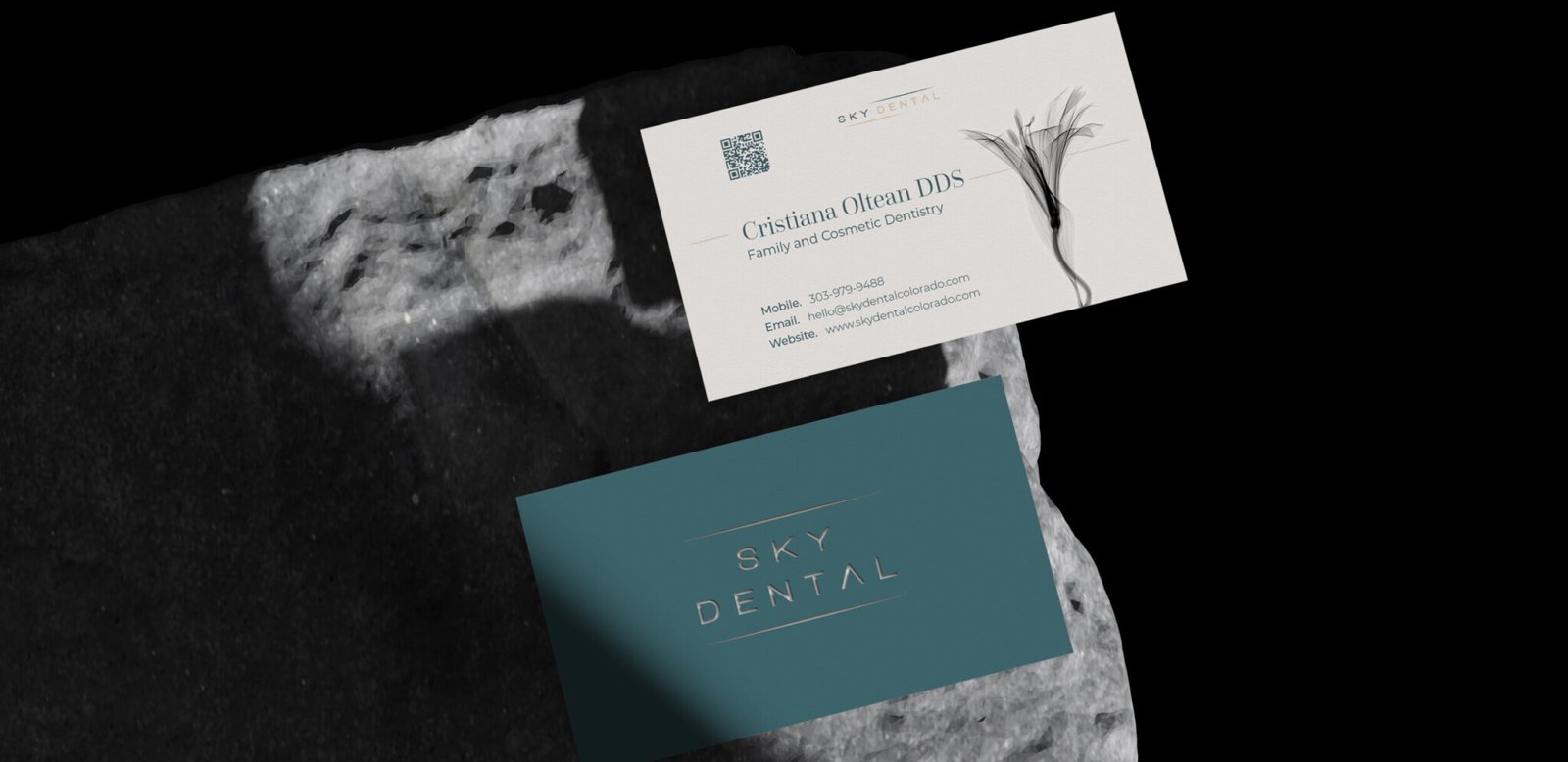
In addition to the website, we designed new business cards and stationery that reflected the refreshed brand image. These elements ensured a consistent look and feel across all physical touchpoints, reinforcing the brand’s identity.
Step 10: Testing and Launching
Before the official launch, we conducted a series of rigorous tests to ensure the new website delivered a seamless user experience. This meticulous process included functionality testing to verify that all features operated correctly, usability testing to confirm the site’s ease of navigation, and compatibility testing to ensure consistent performance across various devices and browsers. Only after these thorough evaluations confirmed the site’s perfection did we proceed with the launch.
Visit the new site here.

Last but not least: Celebrate the Success of Launching Another Great Digital Product
At Thinkstor Global Strategies, we are passionate about helping businesses shine. This project adds another milestone in our journey of creating impactful and authentic brand identities and exceptional digital experiences. I am fortunate to have partnered once again with Denis Harda from Vectolis, and Cristina Nagy to design and develop yet another beautiful web product!
We couldn’t be prouder of the outcome and the positive impact it will have on Sky Dental‘s patients and community 👨👨👧👦
Thank you, Dr. Cristiana Oltean DDS, for your trust and continued partnership!

